WP e-Commerce – how do I choose an image size and what do all the settings do?
There are really two parts to this problem, the considerations involved in choosing a good image size and the technical issues involved in implementing your plan. I will cover this in two posts, this first one will deal with choosing your aspect ratio. Part 2 will cover putting your decision into action in WP e-commerce.
Part 1.
People often just dive right in to uploading product images without any pre-planning. Not planning your image strategy before you start building your shop can leave you with an ugly shop and a lot of work to do all over again to repair things. Those that do consider a plan often ask me “what size should the image I upload be?” I would have to say you are starting with the wrong question. So lets come up with a list of questions you should ask yourself before you begin.
1. What am I selling?
Pretty obvious but often just ignored. Simply think about what shape best suits the things you want to sell. We are not talking about size but shape. To be even more accurate, proportion or aspect ratio.
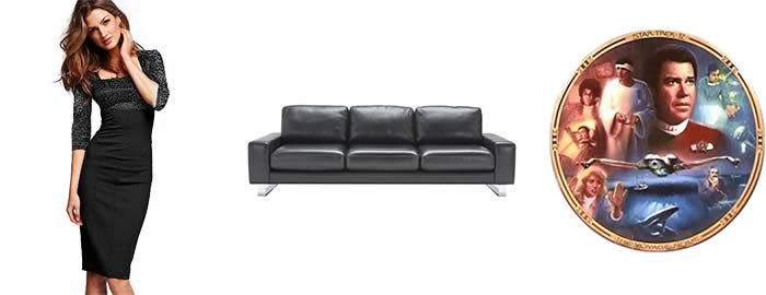
You could be selling clothing which has been photographed on models, you could be selling sofas, you could be selling Star Trek collectable plates. If it’s that last one please don’t call me to build your shop! Obviously the gals are tall and thin, the couches wide and short and the plates well you get the idea, can we not talk about them.
So obviously you need a tall skinny portait shaped image for dresses, a wide landscape one for sofas and a square one for those other things, problem solved. Not so fast folks.
2. What else are you selling?
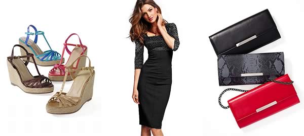
Chances are you do not just sell dresses, what about handbags, shoes, jewelry? Couches, what about chairs, lamps? Plates, well OK more plates, your problem is solved!
What to do? You have a few options. Consider playing to the main product, a tall image suits clothing, so work your accessory images to fit that format. Plan your photography.
Now that couch, you could take the same path as the clothing, maybe put 2 chairs in an image to stick with short and wide. Well that could get pretty weird with tall skinny floor lamps for example. So maybe a compromise. Something more square, but still a little wider than tall, so that lamp will not be lost and a couch will still be a decent size.
The images below are outlined to show the use of white space to keep each actual file the same shape. The images look different shapes because the extra image space matches the background color. If it was not for the outline I have applied to demonstrate you would not know the actual shape of the file.
Here is an important trick in use, crop or add extra space to your image to make the file the right shape. In this case white works, but you could use your site background or a color sampled from the image. Why do you do this? Well you need to read part 2 for that.
3. What do my customers need to see?
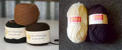
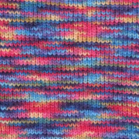
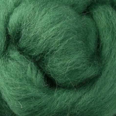
You have lots of pictures of your product, but are they the right pictures? What is it that is important to your customer when trying to decide if they will purchase or not. For example if it is electronics do you have a close up of the controls? To take an example from my personal experience, craft supplies, specifically wool and spinning fleece. Photographs like this would seem obvious.
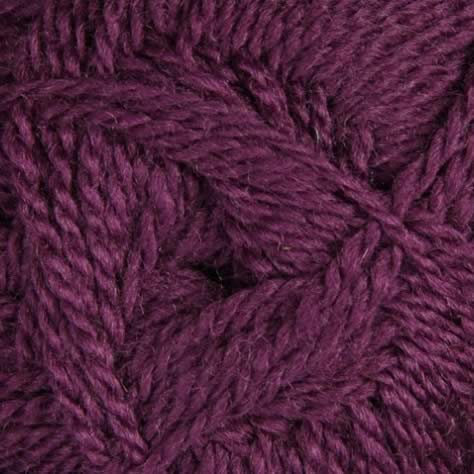
Both of those are perfectly reasonable pictures of balls of wool which I found on actual shop websites. But what is it you want to know about wool? What is the wool or fibre like? How will it look when I knit something with it? These images do not help much, they lack informative detail and are too small, so your customer will hesitate to buy. Sometimes size matters, although a little off topic do be generous with your image size, screen real estate is free. Here are three images of a good size that convey fibre which is important for a single color wool, and finished knit pattern which is what your customer is trying to imagine with a multi-colored wool.
What was that about aspect ratio?
You have a shape in mind lets start making products! Whoa, lets set that aspect ratio in stone. Whats the fuss my image is 165 wide by 270 high you say. What is that aspect ratio? Well it is 165 x 270, sure that’s correct, now quickly off the top of your head how tall would an image 200 wide have to be to maintain that aspect ratio? Still thinking? Me to!
Actually 165 x 270 can be distilled to an aspect ratio of 11 x 18, still not doing it in my head! We will have to maintain our aspect ratio over different sized images.
How about we make our lives a bit easier, lets make that image 180 x 270, not a big difference but each is evenly divisible by 90, 2 x 90 = 180, 3 x 90 = 270, our aspect ratio can be reduced to 2 x 3!
So let me ask you again how tall would an image 200 wide have to be to keep our aspect ratio? I bet you had the answer before I finished typing the question. Our ratio is 2 units of width, so divide 200 x 2 = 100, our height is 3 units, so 3 x 100 = 300. Our image is 200 x 300.
No time for math, the complete commemorative set of Star Trek: The Original Series – Season One – Remastered Edition – 1966, in a box that looks like a star fleet communicator just arrived, you have some popcorn to pop. Then you are in luck plate guy, square is the easiest shape of all. 1 x 1, what could be easier. I do not think we need an illustration, microwaves on full!
So choose an image shape that suits your product, plan your image production for it and use extra image space to make awkward shaped products fit into your plan.
I strongly suggest picking a nice easy aspect ratio from the start 1 x 1, 3 x 4, but if you find yourself already committed to a complicated one like 693 x 397 the internet, not the Enterprise, comes to your rescue, use the Aspect Ratio Calculator to get the correct size for your thumbnails etc.
In part 2 we take our aspect ratio and give it a work out in the settings pages of WP e-Commerce. There it’s true significance will be revealed.



2 Comments
Anna Neon
October 26, 2011Thank you very much for this beautiful post! Great images, I am ready to buy! 😉 The explanation is what I can really use and now what I really need is part 2!
mgason
December 12, 2011Part 2 is online folks, glad you enjoyed the post Anna