WP e-Commerce – image size and what do all the settings do?
Part 2.
So you have read all the cerebral artistic and sales theory of part 1, time to get technical and practical. We left off talking about aspect ratio’s. There is one golden rule that you shall not violate when producing images for your WP e-Commerce shop.
All of the images you upload must have the same aspect ratio.
Why are they so important?
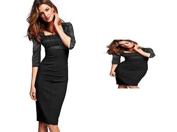
WP e-Commerce generates all of the images required for your shop from the one file that you upload. This saves you a lot of work making multiple versions of each image, but it creates it’s own set of issues. If I upload this image on the left with the incorrect settings I could end up with the product image on the right displayed on my site.
I strongly suggest picking a nice easy aspect ratio from the start 1 x 1, 3 x 4, but if you find yourself already committed to a complicated one like 693 x 397 the internet, comes to your rescue, use the Aspect Ratio Calculator to get the correct size for your thumbnails etc.
So what actually happens when you upload an image? Where do they go? What gets made? Lets break that down.
1.
If you follow my rules the image you upload is displayed without change in the popup “lightbox” when a user clicks the main image on a single product page. So pick a size that is generous but reasonable. This is the last stop, your user has clicked several images to get here, they want some detail!
2. Single Product Image Size:
The next largest image is generated by the plugin and displayed on the single product page. Again do not be tight, pixels are cheap. Go for the biggest image that will fit well with the display of all the relevant product information. Do not force your user to click for the lightbox.
3. Default Product Thumbnail Size:
The thumbnail which is displayed on product pages in either list or grid views. Again make it a reasonable size. The user wants to quickly see which product it is so they can click through to more information on the single product page. In some cases where you supply an “Add to Cart” button in these views you want to convey enough information for your customer to purchase right from these pages.
4. Gallery Thumbnail Image Size:
lastly the image size that is displayed in Gold Cart galleries on the single product page. This is only of interest to users of that plugin. If you do not have it, you will not see these settings in your WordPress backend.
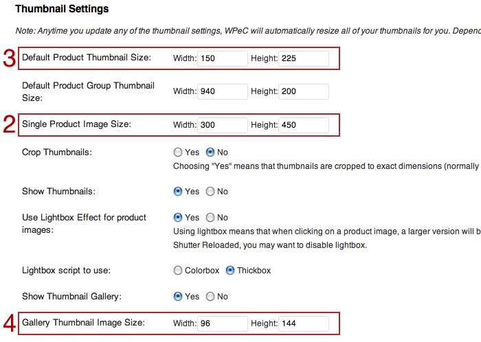
Below is a screenshot of part of the WP e-Commerce Presentation Tab. You can find it by clicking Settings/Store/Presentation Tab and scrolling most of the way down. The main areas of interest are marked, 2 and 3 relate to all users and 4, “Gallery Thumbnail Image Size” only to WP- e-commerce Gold Cart plugin users.
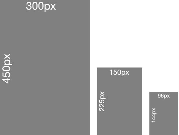
Let us take the settings in this screenshot as a basis for our discussion. What size is the main image I uploaded to use with these settings? There is no way to know. We can tell what the aspect ratio was. 150 x 225, 300 x 450, 96 x 144, all of these are aspect ratios of 2 x 3. So my main image had an aspect ratio of 2 x 3 and none of these smaller images created by WP e-Commerce will be distorted because they maintain that aspect ratio. My main image could be 400 x 600, 462 x 693 or 500 x 750, all of these would work and I am free to upload each and every one and it will display distortion free at all sizes. In this case size does not matter. I do not need to make all of the images the same size before I upload, just you guessed it, the same aspect ratio.
So you see there is no correct size. There is no correct aspect ratio. What matters is consistency.
What is that extra setting Default Product Group Thumbnail Size?
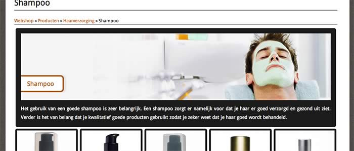
This is the size of the thumbnail you upload in the category creation area. It is independent of other images. For total control make the image the size you want and make the settings the same. This image will be displayed at the top of product category pages if Show Product Category Thumbnails is checked. Thumbnail makes people think small. You may notice the settings in the screenshot above are in fact quite large. A big size and some clever CSS can produce a very nice banner style image. For a great example see this website http://www.mencare24.nl/shop/producten/haarverzorging/shampoo
But you read all this to find out what size!
Ok, ok I will make some recommendations, but that is all they are.
The main image for the lightbox, no more than 800 pixels wide or 700 pixels high so that it fits on most screens comfortably.
Main product image no more than 500 pixels wide as it starts to overwhelm the text. Height is not such an issue but 550 pixels would be pretty large.
Thumbnails, well it really depends on your product and how many you wish to display on a page.
For those of you who just refuse to make a decision here are some sets that would work nicely if they suit your product.
1. aspect ratio 3 x 4 portrait
Main image uploaded 600w x 800h
Single Product Image Size: 360w x 480h
Default Product Thumbnail Size: 180w x 240h
Gallery Thumbnail Image Size: 111w x 148h
2. aspect ratio 5 x 4 slightly wider than square
Main image uploaded 800w x 640h
Single Product Image Size: 400w x 320h
Default Product Thumbnail Size: 250w x 200h
Gallery Thumbnail Image Size: 120w x 150h
3. aspect ratio 1 x 1 square
Main image uploaded 700w x 700h
Single Product Image Size: 380w x 380h
Default Product Thumbnail Size: 230w x 230h
Gallery Thumbnail Image Size: 125w x 100h
Why such an odd number for the Gallery Thumbnail Image Size?
The gallery thumbnail image will in some themes be displayed beneath the main single product page image. To make things line up nicely choose a size that will fit neatly. How? Well if you want 3 thumbnails to fit in a row you divide the Single Product Image Size width by 3 and deduct the margin, padding and border values you have on the the thumbnail. You can choose a number of thumbnails and adjust the size accordingly


7 Comments
Tim
July 29, 2015Hi
Great guide learnt heaps. I have a horizontal scroll bar issue on the Products page, its driving me nuts. Could you please suggest why its doing it. all other pages that the thumbnail is on are fine.
http://woods.id.au/products-page/
Thanks
Tim
Paige
August 12, 2012Hi
Thank you so much for this as I was told about aspect ratio today and i have no idea.
but I am still confused. I was told toI up load my photos as the same size as the single product which is 300×500. Which I have done.
Some images I’ve load today are longer in height as they are full body so I set it at 300w and left the height. I up loaded it & it was blurry so I adjust it and made the height 500 and I think the width was like 190 but still blurry. So now I don’t know what size to make my photos do I leave them and work out the aspect ratio? So confused I didn’t think sort out images would be this hard !
I also agree the whole thumbnail thing does not work at all.
Thank for you for your article 🙂
mgason
September 7, 2012Did you read part 1 of this article? Link at the top.
I suggest you upload a image bigger than the main single product image. That way the customer who bothers to click a single product image will be rewarded with the bigger image in the lightbox.
Say you had square images. I would upload 700×700, set single product 300×300, product group thumbnail 180×180.
Your problem seems to be that some images are square and now you have some that are taller.
The trick to use is to add some blank space to the sides of the images in a image editor. You make it the same color as the background of your page. Add enough to make them square. They will then scale properly.
You can of course set your images to be any shape, whatever suits most of them. Then you use that trick to make the odd ones fit the common shape (aspect ratio)
Part 1 explains doing that with examples
Geoff
August 6, 2012Thank you for explaining WPeC’s confusing thumbnail settings so well! Very much appreciated.
Billedstørrelse og mange andre indstillinger | WordPress
July 13, 2012[…] http://gasolicious.com/commerce-image-settings/ This entry was posted in WP e-Commerce by Jacob Voldby. Bookmark the permalink. […]
Andrew
July 9, 2012I have created my products and I uploaded an image for each product. When i click on the thumbnail on the products page, Two images appear, one behind the other. It is the same image. Any idea why this is occuring?
Anonymous
July 9, 2012It sounds like you theme has a built in lightbox. I suggest going to Settings/Store/Presentation tab and set “Use Lightbox Effect for product images:” to NO